Jonas Weber · 5 October 2026
Exploring the Dynamics of Link Equity Flow in Interconnected Website Ecosystems Using Advanced Visualization Methods
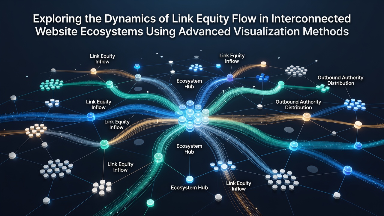
Link equity represents the value that passes from one webpage to another through hyperlinks, and researchers have mapped its movement across large website networks by combining graph theory with modern rendering engines. Data from network analyses shows that equity concentrates along certain pathways while dissipating in others, and visualization platforms now render these patterns as layered node-link diagrams that update in real time. Observers note that such methods reveal clusters where authority accumulates rapidly while highlighting isolated nodes that receive minimal transfer.
Studies conducted on multi-domain portfolios indicate that equity flow follows predictable decay rates based on distance from high-authority sources, and tools incorporating force-directed layouts plus heat overlays allow analysts to trace these gradients without manual spreadsheet review. In October 2026 several research groups released updated datasets from crawls performed across commercial and educational domains, and the figures reveal consistent bottlenecks at subdomain boundaries that visualization software can flag automatically.
Core Mechanisms of Equity Transfer
Hyperlinks function as directed edges in a directed graph model, and each edge carries a portion of the source page's equity determined by the total number of outbound links on that page. Algorithms derived from PageRank variants calculate this distribution, yet newer implementations add temporal weighting so that recently created or updated links receive adjusted scores. Researchers have observed that visualization layers built on top of these calculations surface anomalies such as sudden equity spikes after site migrations or content refreshes.
Interconnected ecosystems often contain bidirectional links between related properties, and advanced renderers display these as curved arcs whose thickness corresponds to calculated equity volume. When analysts apply clustering algorithms the resulting groups align closely with topical categories, and the same diagrams expose cross-cluster bridges that serve as primary transfer routes. Evidence from academic web-graph studies confirms that a small percentage of edges accounts for the majority of equity movement in most sampled networks.
Visualization Techniques and Tool Integration
Modern platforms combine SVG or WebGL canvases with GPU-accelerated layouts to handle graphs containing hundreds of thousands of nodes, and users can toggle between force-directed, hierarchical, and circular arrangements depending on the research question. Color gradients applied to nodes indicate equity density, while animated particle flows along edges illustrate directional transfer rates over selected time windows. Observers note that these interactive features reduce the time required to identify under-linked sections compared with static reports.
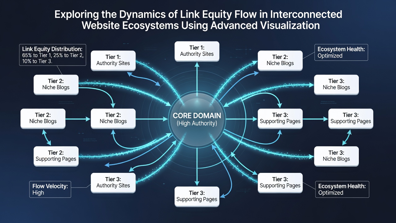
Integration with crawl logs allows platforms to overlay freshness metrics onto equity maps, and analysts can filter views to show only links that have contributed to recent ranking shifts. According to reports published by the Australian Research Council on digital infrastructure, such combined datasets improve the accuracy of predictions about how changes on one site affect neighboring domains. Filters also isolate equity loss points caused by nofollow attributes or robots.txt restrictions, presenting them as dashed or faded connections in the visual output.
Applications in Multi-Site Portfolio Management
Portfolio managers responsible for dozens of related domains use these visualizations to plan internal linking campaigns that redistribute equity toward priority pages. One documented case involved a network of regional news sites where the diagrams highlighted an overlooked hub page that funneled disproportionate equity to low-value archives. After restructuring the links the same visualization confirmed a measurable redistribution toward monetized sections within weeks.
Cross-domain patterns become especially visible when analysts import data from multiple crawl sources into a single canvas, and government digital economy reports from Canada have noted similar clustering effects in public sector websites. The resulting maps help teams decide whether to consolidate properties or strengthen specific bridges between them. Temporal playback modes further allow comparison of equity landscapes before and after structural changes, revealing both intended improvements and unintended side effects.
Conclusion
Advanced visualization methods now make the previously abstract movement of link equity across website ecosystems observable and quantifiable. Researchers continue to refine rendering algorithms and data pipelines, and the October 2026 data releases demonstrate ongoing progress in handling larger, more dynamic graphs. Organizations that adopt these tools gain clearer insight into how authority transfers through their interconnected properties, supporting more precise adjustments to internal architecture and external link acquisition strategies.